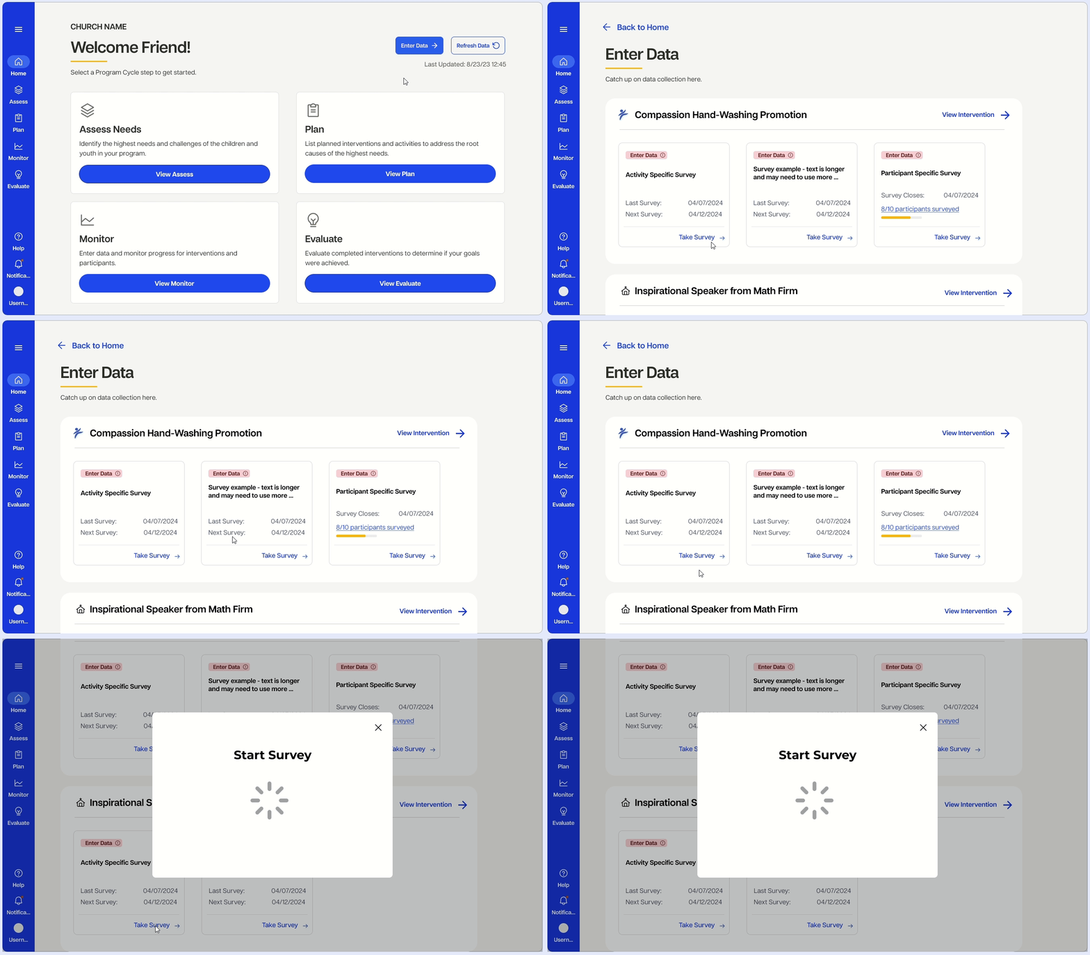
As a summer UX Design intern at Compassion, I designed a new version of a developing app based on past usability testing, working alongside the UX Designer for the app.


The app is complex with deep navigational hierarchy. Users found themselves getting lost in pages and unable to understand where to go. Below is an example of the amount of clicks it would take for a user to complete a single survey.

The visual markers used to communicate data were confusing users, stopping them from making important choices.

Church leaders already have heavy workloads. Asking leaders to complete so many surveys for data collection felt stressful, especially in conjunction with the lengthy navigation flows.

I worked with visual designers, UX designers, and National Office leaders to understand the requirements needed for make PCA successful, which meant adjusting my redesigns accordingly. I was able to create improved design iterations based on business needs communicated to me.

The success of an intervention is measured by 2 variables: implementation and effectiveness. Implementation measures how far along an intervention is in its building process. Effectiveness measures the impact of an intervention on the local community.

While the icons in the original design were nice, users could not intuitively associate the symbols with their meaning. In the app, cards are side-by-side. In an environment where data comprehension should be quick and intuitive, users felt overwhelmed with the icon data markers.

I relied on sources such as Google’s M3 guide, Nielsen Norman group, Mobbin, and UX stack exchange to understand how to improve navigation.


Most importantly, I used my ability to empathize with the user to create impactful and tangible product changes, like the addition of a single page for data collection.

Users were expected to navigate to each individual intervention, scan which surveys need data, and navigate to another intervention to complete more surveys. This put even more effort on the users to complete surveys - an already arduous task.


I used Compassion’s new design system on version 2 to increase cross-product cohesion. I also used many of Google’s M3 components to speed up development.

To support the deep navigational requirements of the app, a top navbar provides a roadmap to where users are.


Instead of having to navigate to individual intervention pages to complete surveys, a single page from home displays all surveys needing data.


Data comprehension made easier through direct language and labelling.

Version 2 is set to be developed in the next fiscal year. Ellie (my wonderful supervisor and mentor) will incorporate the most viable and effective redesign ideas and recommendations.
This was the largest professional setting I worked in. I worked with developers, stakeholders, and other designers and Compassion staff, helping me learn how to design with and for other people. More than anything, I got to learn from my UX design mentors how many meetings are required to be a designer! UX designers are not only designers, but also communicators, listeners, and facilitators.